High Park Coffee Company
Branding a sustainable, organic Canadian coffee roaster
“Drink coffee. Do good.”
High Park Coffee Company is a feel-good do-good coffee brand roasting organic and fair trade coffee by using environmentally conscious and sustainable practices. Its goal is to make premium coffee while giving back and leaving a greener footprint for future generations. With one bag of coffee purchased, one tree is planted around the world to help with global reforestation efforts.
The challenge for us was to translate the mindset, characteristics, location and target consumer of HPCC and match it to a brand that would resonate with the green-minded community of coffee connoisseurs, city explorers and nature lovers.
The result? High Park Coffee Co. is a tribute to the outdoors, city parks and good times spent with friends sippin’ java — and that's exactly what we had in mind when designing this brand; something that feels and looks as good as that first cup of coffee in the morning.
A great cup of coffee can make the world a better place.
Services
Discovery & Strategy
Brand Positioning
Naming
Identity System
Typograpghy & Colour
Brand Design & Guidelines
Packaging
Art Direction
Messaging
The Logo
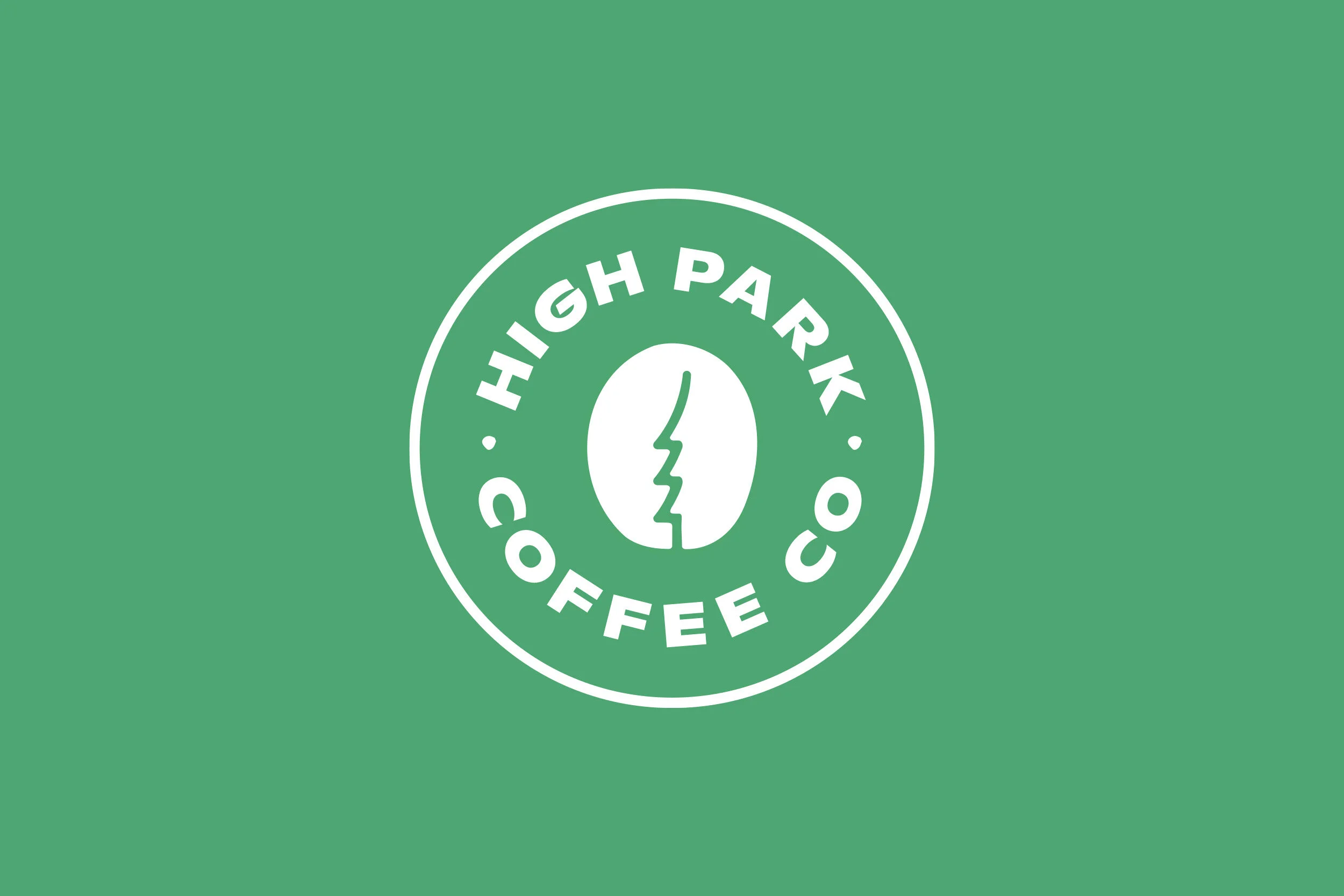
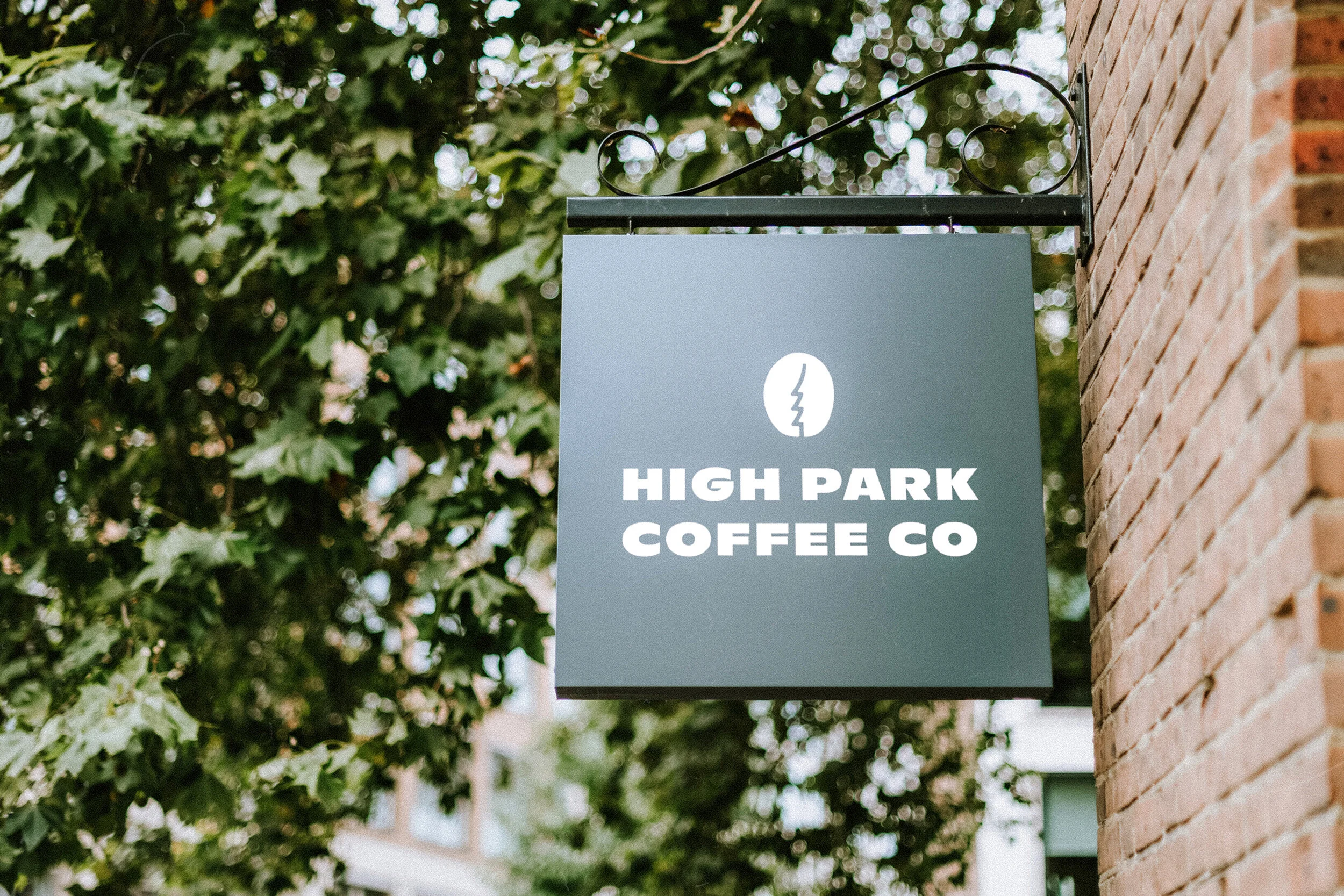
The High Park Coffee Company’s logo was designed to feel like your favourite coffee house — timeless and bold like a strong cup of coffee. It’s a combination of 3 brand elements: coffee bean, park trees and the heel of a boot to symbolize leaving a green footprint.
Colour & Type
The High Park Coffee Company colour palette is heavily inspired by colours that appear naturally outdoors and in the park. Shades of green trees, blue sky's, puffy clouds, earthy tones, autumn leaves, snowy roads, ponds and pathways. The logo, header and tagline typeface is Ginto Nord. Lato is used for the body copy.
Patterns & Packaging
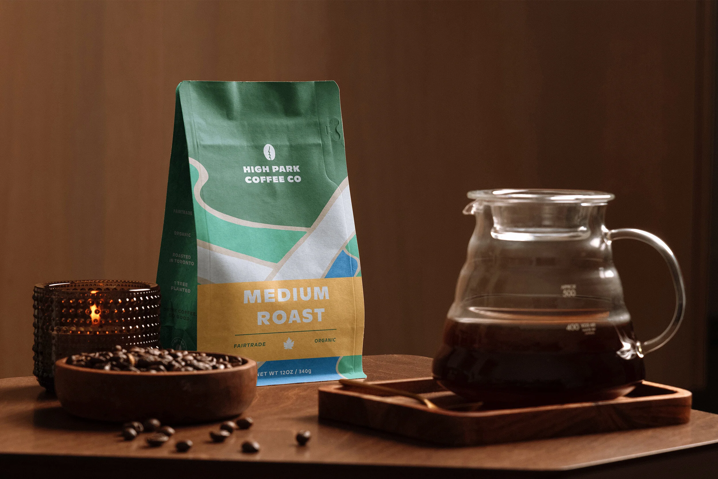
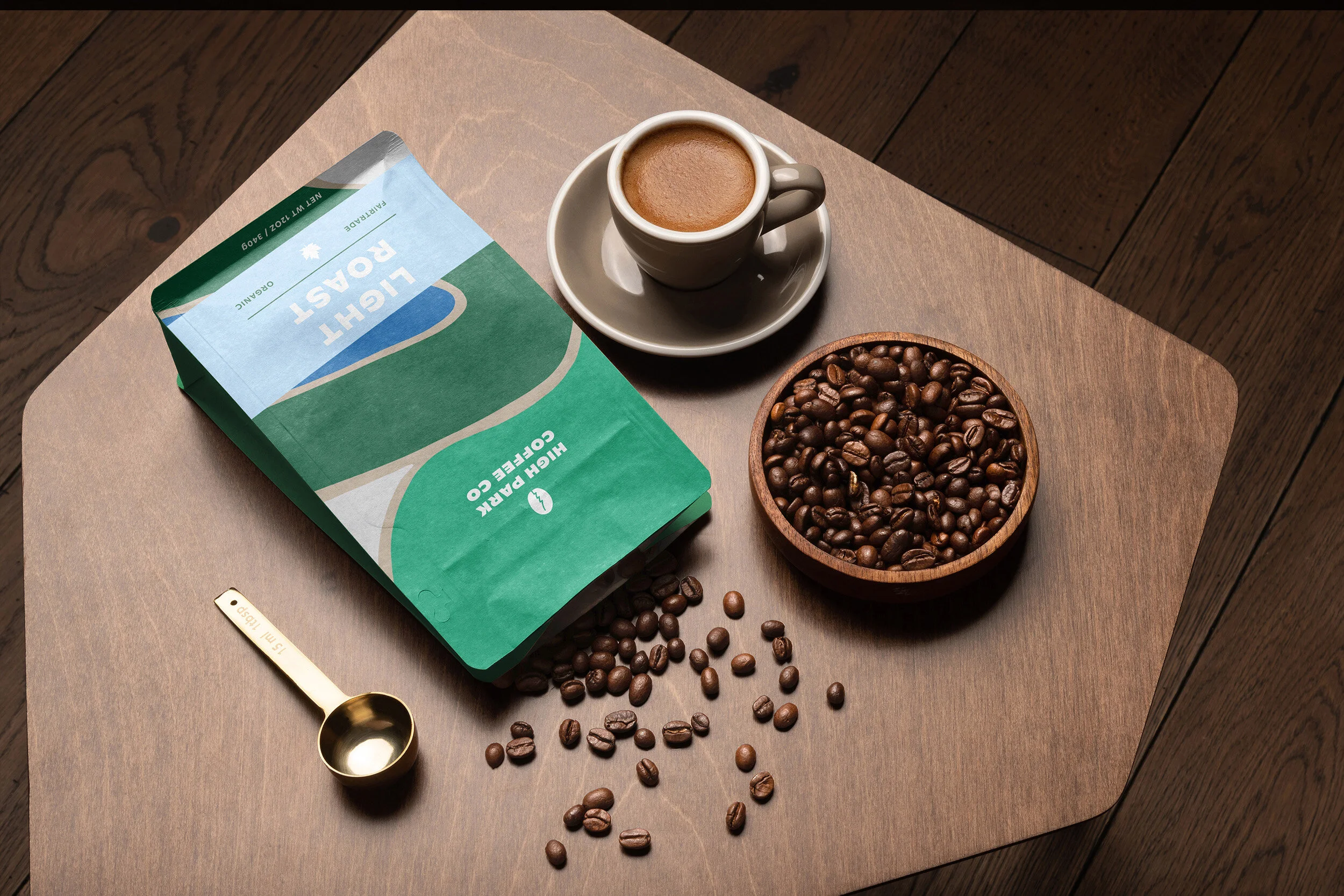
Coffee packaging has become common place — brown bags with a simple label. We wanted to steer clear of that direction. High Park’s packaging is warm, inviting and fun, shades of green, blue and grey on kraft paper symbolize overhead views of trees, ponds and pathways in the park.
Credits:
Studio: Park Creative Studio
Lifestyle Photography: Mike Marquez, Thom Holmes, Nathan Dumlao, Eden Boudreau
Note: This brand is not real. It’s a concept designed by Park Creative Studio. If you’re interested in learning more about it, have a similar project or want to use this design for your business please contact us .


